

Lesson 13
Now we're going to do some practice. We're going to spell out some words. The first is suit, which is s, u, i, t. On the next line we will write j, u, i, t: juit. On the next line we will write s, u, y, j. And on the next line we will write i, t, u, s. Then fill up the rest of the page with combinations of your own.
Once again, check that everything is sloping the same way. Get a ruler out, draw lines through, and check that your angles are good. Light up, dark down, light up, dark down, light up, dark down. Check that the distances between your strokes are more or less the same. And check that your letters are not going below the line, that they're not going above a line, and that they're not getting shorter.
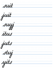

If you look at Worksheet 19, and you were to get a ruler and draw a line through the verticals of the s and the t and the u and the i, you'll see that the s has a different angle from the rest. That's because I drew this s separately, and the printed alphabet, the typescript one from the computer, is more vertical. So that's exactly what you need to look out for, and that's the kind of thing I talk about.
Ideally, the typeface one should be sloped far more forwards than it is. As you can see from the s, it has a nice forward slope, and the one for the printing press is more upright. But this is a matter of choice, how you want to do it. This is a good example of what to look out for in your own writing, so it's here to teach you.
The s from the existing printed alphabet was no good, so I made my own, and that's why it's slightly different in its angle. But that's a good way to teach you what to look for.
Cursive — Part One: The Small Letters · Evan Millner · Published by Abecedaria Press