

Abecedaria Press · Basic Lessons in Handwriting for Beginners
Lesson 2
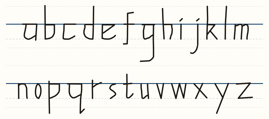
In this lesson you will learn to write a simple printed alphabet. It is made for anyone who has trouble controlling the pen. This is a common problem, and the solution is to do the opposite of what is commonly taught.
When pupils learn to write, they are always taught to sit their letters on the line, so that the letters go up from it. The result is that they have a lot of trouble controlling the tops of their letters.
Here we do the opposite. We hang our letters from the line.
Imagine that the line is a washing line, and that each letter is held on it by clothes pegs. The top of every letter touches the line, and the letter hangs down from it, just like a shirt hanging from a washing line.
When the letters hang from the line, the writing always looks even. Your eye is drawn to the line, so it does not much matter if the bottoms of the letters are not all the same length. One of the great difficulties of handwriting, getting everything lined up, is taken away.
This alphabet is a very simplified form of the Chancery script. Chancery was used for handwriting in England in the time of Henry VIII and Elizabeth I. It is a very angular script: it is made mostly of straight lines, with very few curves, and a straight line is much easier for the hand to control than a curve. That is why we teach Chancery first, before print or roundhand. I designed this alphabet for a pupil of mine who could not control curves.
Every letter in this lesson can be made with straight lines only. If you can make curves, you may round some of the corners. If you cannot yet, straight lines will do: your letter will look a little clunky, but it will still be clear, and it cannot be any other letter. Later, as you grow more confident, you can bring in a curve.
A note for teachers. If a pupil finds it hard to understand that the letters hang, draw a pair of clothes pegs on top of a letter, as though it were pegged to the line. You can even draw a little T-shirt hanging from the line, with its pegs. Then the pupil will understand that the letter hangs from the line, just like a shirt.
Watch the lesson on video: Letters that hang from the line
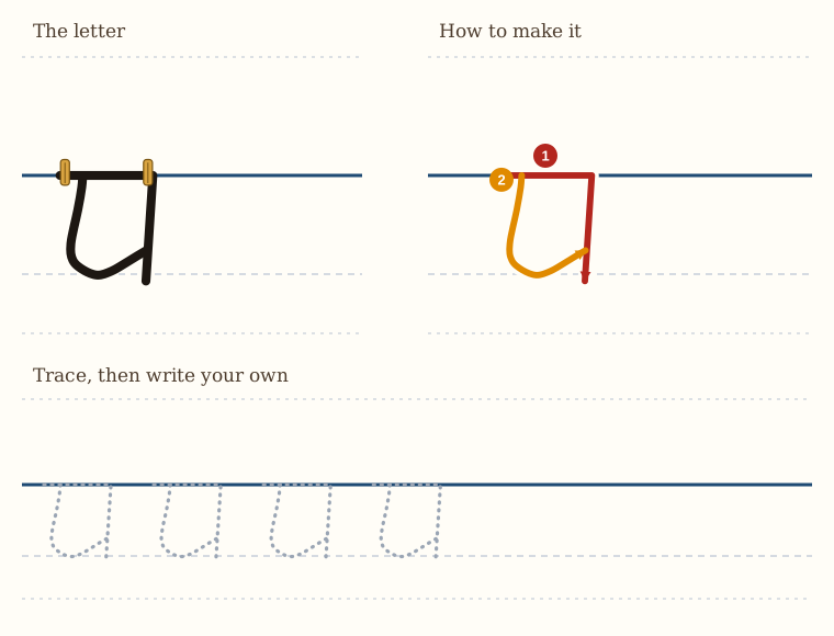
Remember: the letter starts at the line and hangs down from it.
So that is our a. If you really want to, you can give it a little tick on the bottom, and be more ornate with it if you want to, but that is a very basic letter a.
Are the bottoms even? When you have written a row of a's, rule a line under them along the bottoms. Which stop short? Which go through? Write the row again and correct yourself.
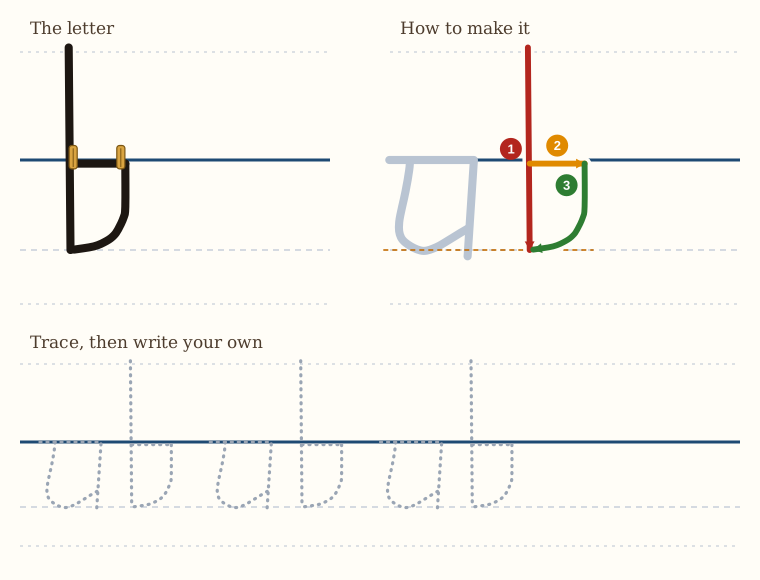
First draw an a. It will give you a gauge for how far down the tall line of the b should go.
So that's a b.
You can put a ruler under the a afterwards, to check how far down the b goes. It will probably be wrong the first few times. It doesn't matter, because we are hanging our letters from the line, like clothes on a washing line. Afterwards we will sort out the bottom, to get it all nice and even. In the beginning, we concentrate on the basic shapes.
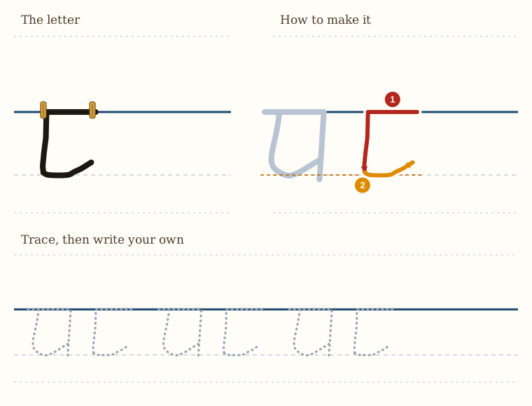
Before we draw the letter c, we are going to draw a letter a, because that will tell us a lot about how far down the c goes below the line. So draw your a.
And this gives you your letter c.
In the beginning, I would make the little curve with a separate stroke of your pen. As you get better, you can do it all in one go, without lifting your pen up.
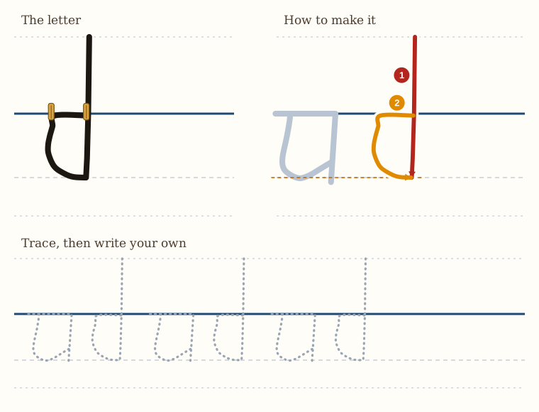
Here we have the letter d. The letter d is actually the same as the letter a, except that the line on the right is much taller. But we form it slightly differently.
Before we start, we make a letter a, so that we can judge how far down the line goes below the line that we are hanging the letter from, like clothes on a washing line.
And that gives you the letter d.
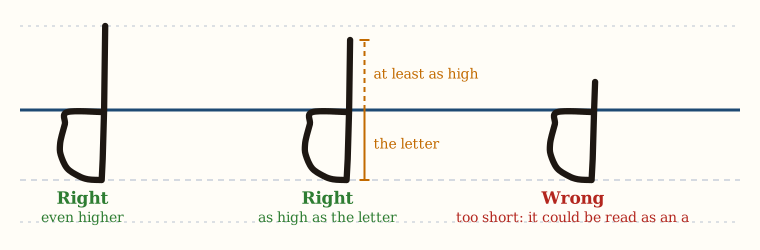
A word of warning about lines that go up and lines that drop down. The lines that go up are like rocket ships that go upwards, and the lines that go down are like submarines that go under the sea. Your line that goes up must be at least as high as the height of the letter below it, and it can be even higher if you want. But it mustn't be shorter, because then it could be confused with the letter a if you were reading quickly, and you don't want to confuse your d with an a.
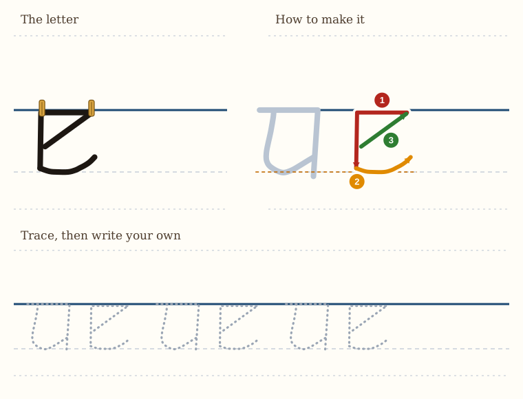
Our next letter is the letter e. Firstly, we draw the letter a. Then, next to the letter a, draw the letter c. You will notice that the letter e is very similar to the letter c, and indeed, we do it the same way.
And then you have the letter e.
In two pen strokes. You can, if you want, do this in two pen strokes. You start at the top right. You draw your pen across to the left. You go down, and then you make the curvy tick at the bottom. Then you pick your pen up, and you draw the angled connecting stroke.
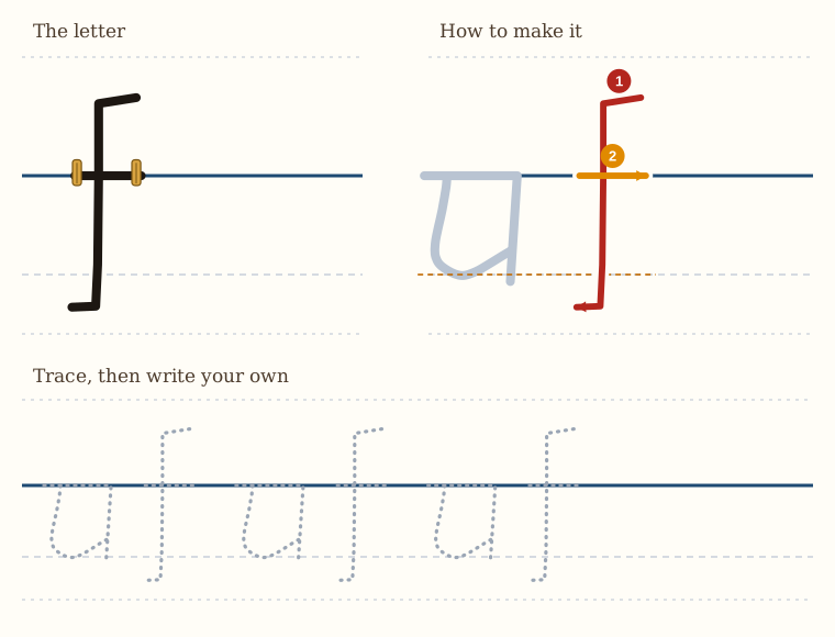
Our next letter is the letter f. Now, this presents problems to most beginners, because this letter goes up quite far, like a rocket ship, and it goes down quite far, like a submarine. So what we do is this.
Firstly, you make a letter a. This will give you an idea of how high up you have to start, because we start this letter at the top. It is done in two lines.
And that is the letter f.
If you want to, you can slightly curve the top and the bottom, so it is not so sharp. So it is like a very long s. That is also possible.
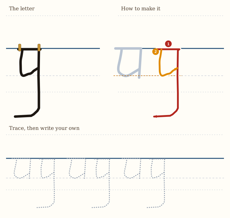
Now we get to the letter g. The letter g is formed from the letter a combined with the bottom part of the letter f.
And how we do it is this. Firstly, we draw a letter a, because that gives us an idea of how far below the line the submarine part of the letter g has to go.
If you look at the a and the g, the top part of the g should look like your a.
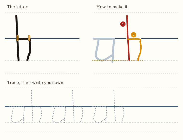
The next letter is the letter h, which is formed in a very similar way to the letter b. Firstly, we draw an a, and that gives us an idea of how far below the line our letter needs to go.
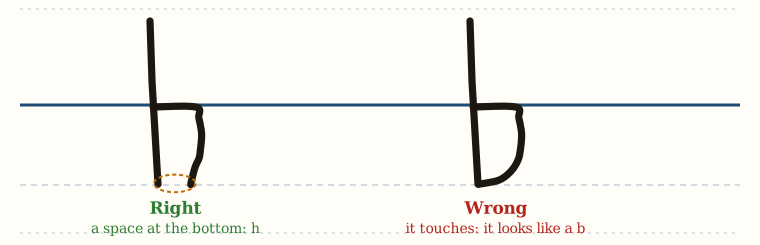
If you do touch the vertical line, or you come too close to it, it looks like a b, and we don't want our h to look like a b. So there must be a space at the bottom. That's the main difference between an h and a b.
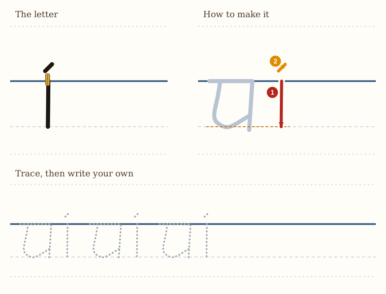
Our next letter is the letter i, which is the easiest of all. It's just a small line. We start on the washing line, we go down, and we only go down as far as the height of a letter a. So firstly, we draw a letter a.
And that's the letter i.
Do not draw a circle on top of it, though. That looks ridiculous. So either a dot, or a little tiny tick like I've drawn.
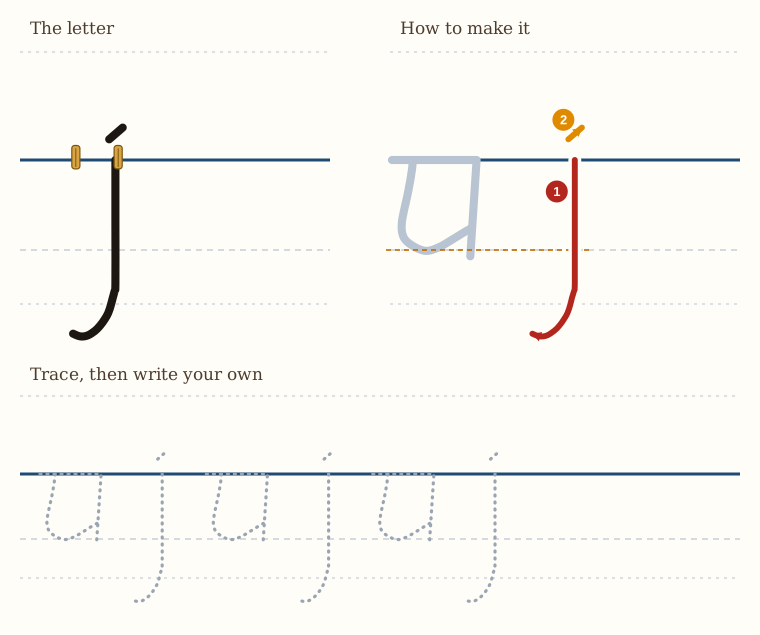
Our next letter is the letter j, which looks simple, but actually gives a little bit of trouble because it goes down like a submarine. Firstly, draw your a.
And that is a letter j.
But do not draw a circle on top of it, because that looks silly.
The j is actually a long i. And in the Latin language, it's just called that, the long i.
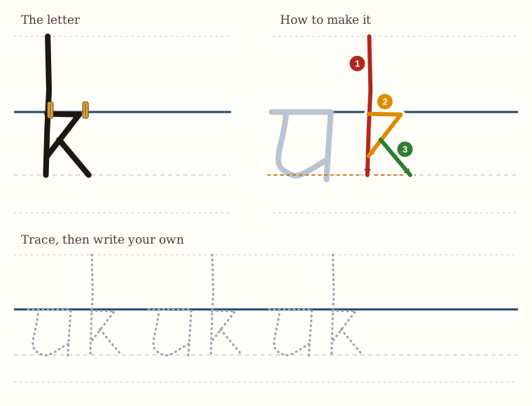
The letter k has a long vertical line, just like the letter h that we did before. So we start off as though we are drawing an h.
You can do it in two strokes as well. You go straight down, then you go across, you bring your line down, you touch the vertical, and then you bring it out again to the right without lifting your pen up. That does not look as nice as if you go down, you go across, you bring it in, make your little angle, which doesn't quite touch the bottom of the vertical line, note, and then you lift your pen up and you make the small stroke to the right.
So it's like a capital R, but the capital R has got a flag on it, pointing up to the sky.
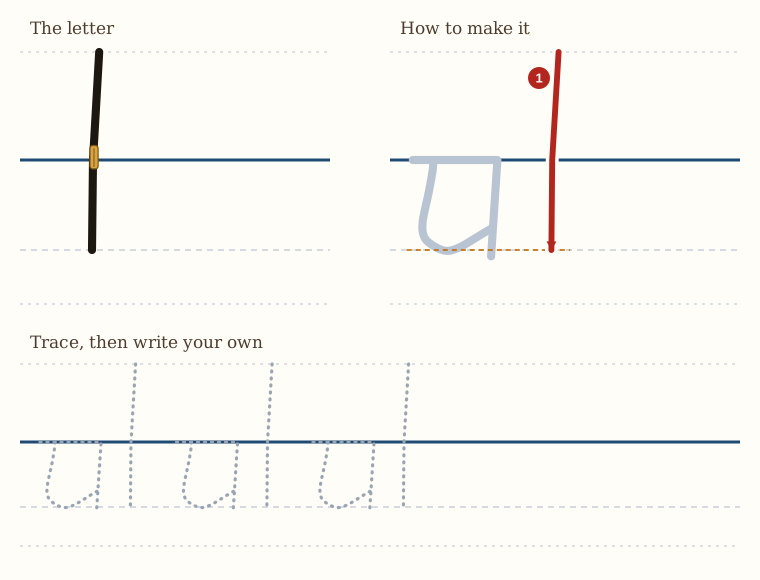
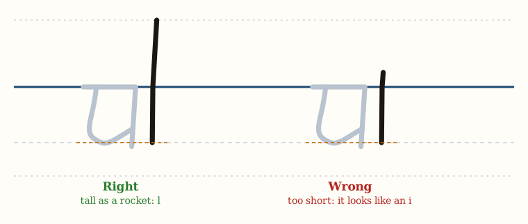
Now we have the letter l. Firstly, we draw an a. The letter l is a letter that you can make too short by accident, and then it looks like an i. So you need to remember that this one goes up like a rocket ship.
That's all there is to it. That's the letter l.
But the main trick is to make sure that it is tall enough, because what happens with most of my students is that they make it too short, and then it looks like an i.
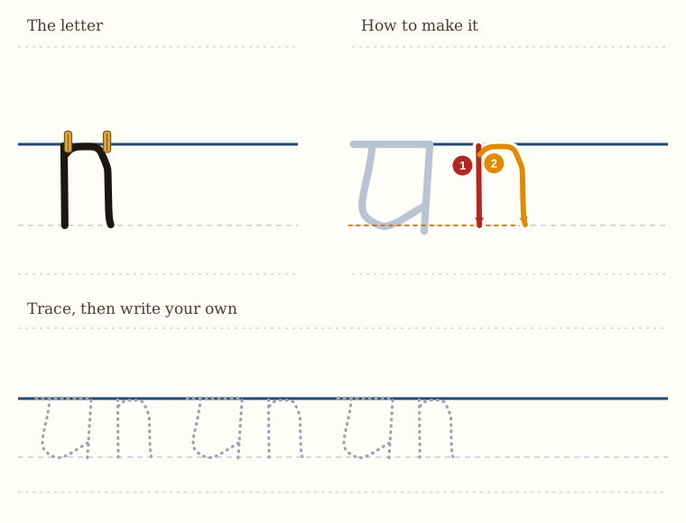
Next, the letter n, which we are going to do before we do the letter m, out of order. So you draw a letter a, and then next to it, you make an i. Then near the top of the i, you curve around, and then down, you make another i. That's really what it is. So it's two i's next to each other, and they're joined with a curve.
One way of thinking about this letter is it's the same as the letter h. It just doesn't have its tall part going up into the sky.
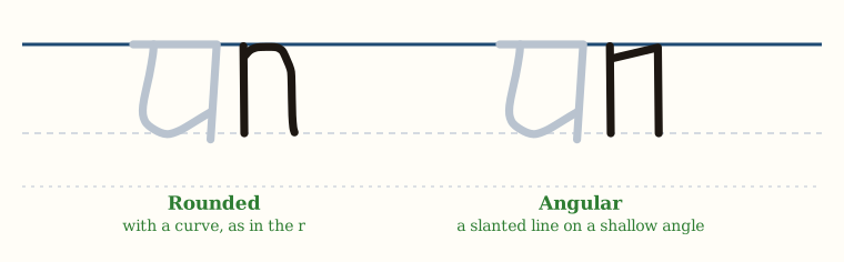
Now, if that curve causes you trouble, then I recommend you do this. You make the i, and then near the top of the i, you just make a slanted line on a very shallow angle, and then down. So your n is a bit more angular and not so rounded, but they both work.
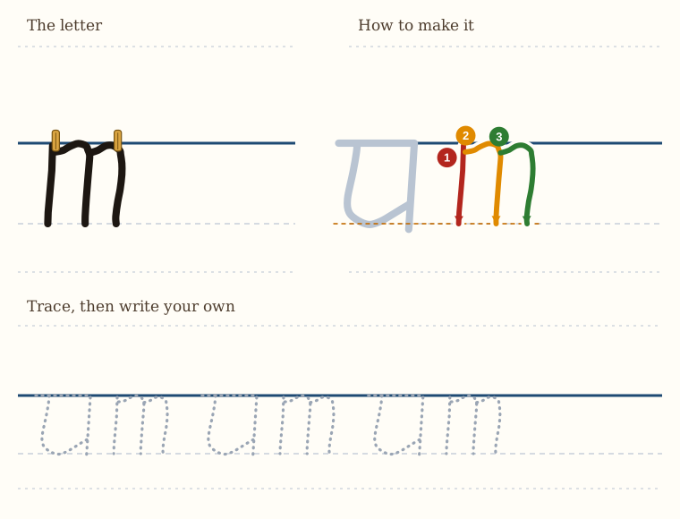
Now we have the letter m. We start off with our a as usual,
So basically, an m is a doubled n. We make our n and we pick our pen up and we make another one right attached to it. Straightforward, very simple.
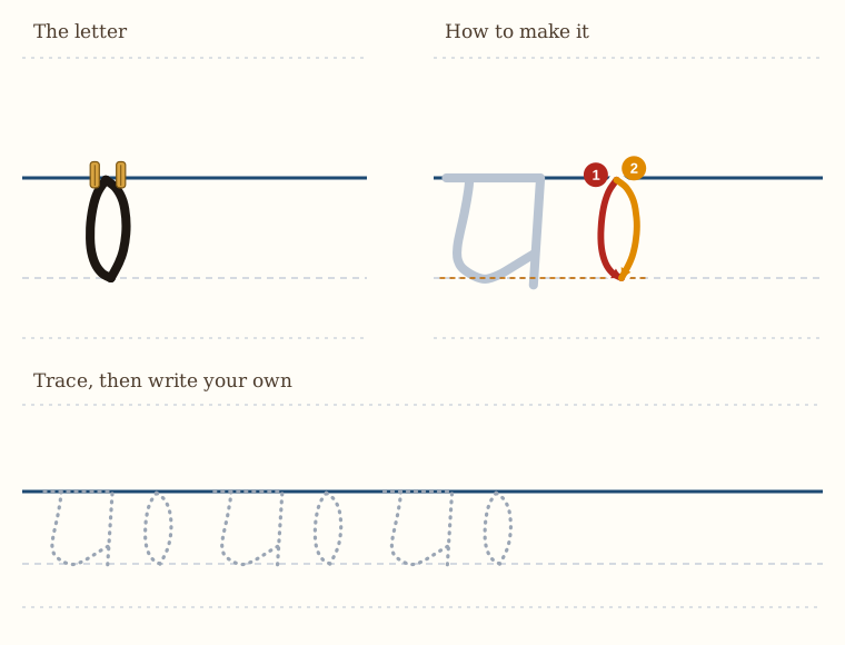
The letter o is the most difficult of all the letters. The artist Raphael, we are told, drew thousands of circles to try to draw a perfect one. We are not going to do that. We are going to simplify it.
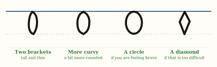
And these two brackets, touching each other, form an o shape. Now that o shape is quite tall and thin. It's as high as our a.
We can make the bracket a bit more curvy, and that will then give us an o that's a bit more rounded. Or, if you are feeling brave, you can start at the line and draw a circle all the way down and bring it back to where you started.
If that is too difficult, then what you do is you make a sharp bracket. So you go down and you make a diamond. So instead of drawing a circle, you make your o into a diamond. And you know how to draw a diamond shape.
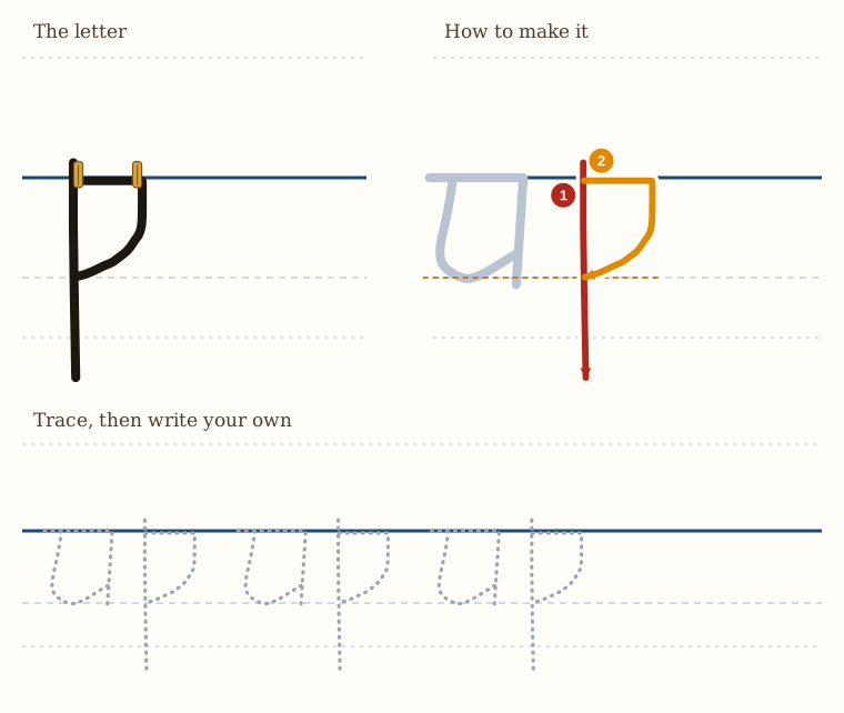
The next letter is the letter p. This letter is very similar to the letter b, except instead of the line being above the clothesline, it's below.
So this is exactly like a b, except that it has a line that goes down instead of a line that goes up.
Remember, the line that goes down must go down quite far.
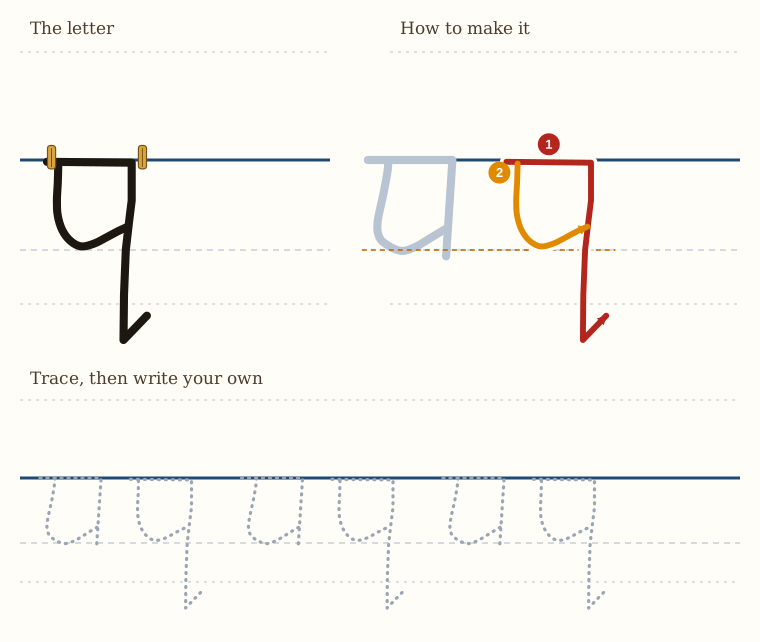
The next letter is the letter q, which is a kind of letter a. It's very similar to a. So we draw our a, and then next to it, we do the following.
So a q is very similar to the letter a. It just has a long line that goes down with a tick pointing forwards at the bottom.
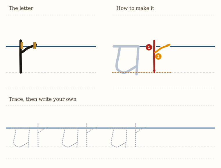
The next letter is the letter r. We firstly draw our a.
So it's like the top part of the letter n, missing the second stroke of the n that goes down like the second i. And that is the letter r.
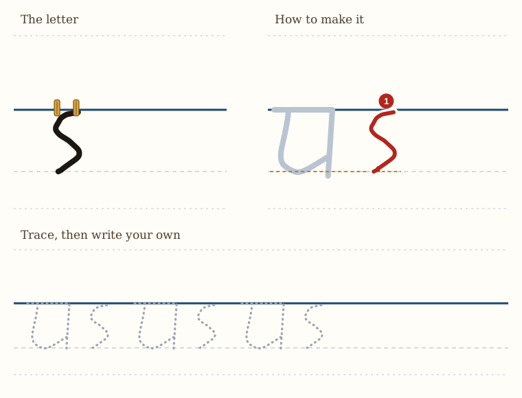
The next letter is the letter s. It's the same height as the letter a. The most difficult part of it is that you need to control your pen to make two curves.
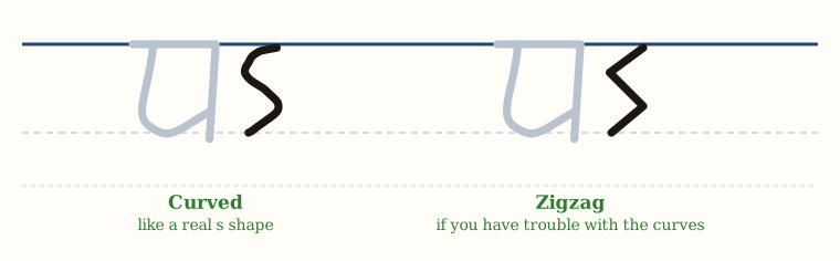
This can be slightly curved, like a real s shape.
Or if you have trouble with the curves, you can make it more like a zigzag shape. So that's the letter s.
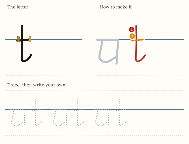
The letter t is a letter that you have to watch quite carefully, even though it's very simple, because it is quite a tall letter, but not as tall as an l.
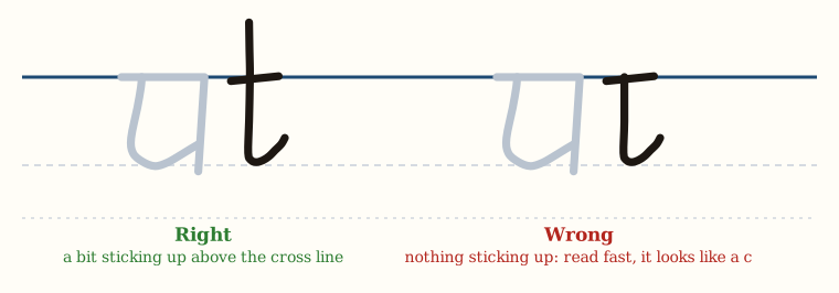
So notice that the t has a bit sticking up above the cross line, and it can be sticking up quite far.
If you don't have that sticking up, and you're reading quickly, it can look like a c, and you don't want that. So that's why you have to have the line sticking up above the top, so that when you're reading fast, you don't confuse it with the letter c.
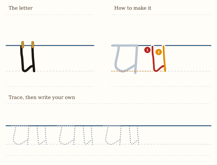
The letter u follows on from the letter t quite nicely.
Or if you prefer, you can do it the other way around. You can start with the i that's further towards the right, and then you can draw the one on the left down and up with a tick that touches it.
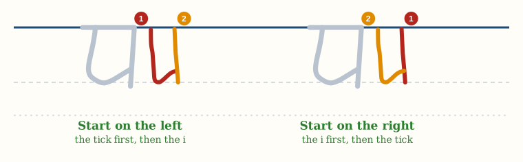
So you can form it in one of two ways. You can either start on the left, or you can start on the right. Up to you.
So if you look at it carefully, it's a bit like a letter a that's missing its top, and that's exactly what it is.
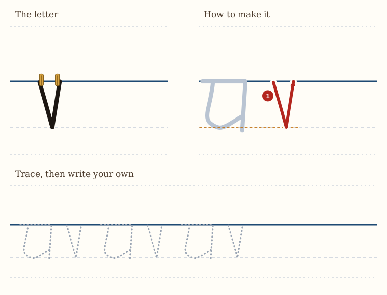
The next letter is the letter v, and we form this in one go.
It's a very simple letter.
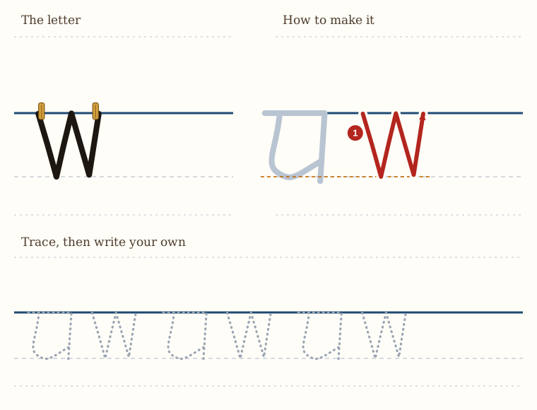
Our next letter is the letter w, which is another simple letter. We start with a letter a,
So it's one v followed by another v, and you don't pick your pen up.
If you want to, you can pick your pen up. You make the one v, and then you make the next v next to it.
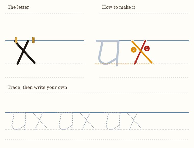
The next letter is letter x.
This angle mustn't be too steep and it mustn't be too shallow.
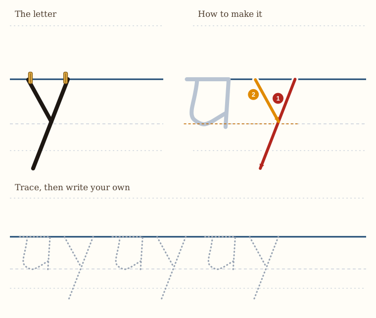
The next is the letter y. Now, this is like a kind of v, but it has a long submarine slope.
So it looks like a v that has a long tail towards the left.
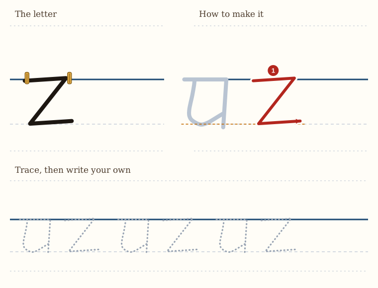
Our next letter is the letter z, or zed, as some would have it. So this is quite straightforward.
And that is our z.
The top of your writing is now even, because every letter hangs from the line. You can learn to control the bottom of your writing as well, and you can check it yourself.
Write a word, hanging it from the line. Then take a ruler and rule a line under the word, along the bottoms of the small letters. Now look: do all the bottoms touch your ruled line? Which letters stop short of it? Which go through it?
Write the word again, and try to make the bottoms even. Then rule a line under it again, and check. Each time you practise, rule a line under some of your words, and correct yourself as you go. Little by little, the bottom of your writing will become as even as the top.
Try it with your own name, and with these words: cat, mud, hen, rain, write.
Basic Lessons in Handwriting for Beginners — Part One: Simplified Italics · Evan Millner · Published by Abecedaria Press