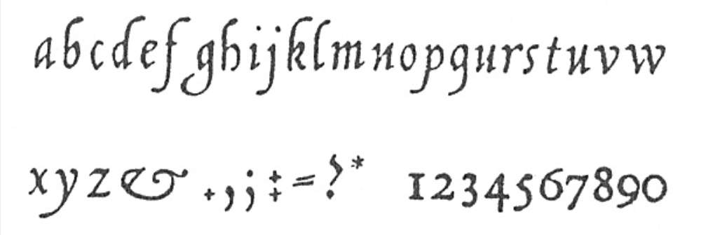
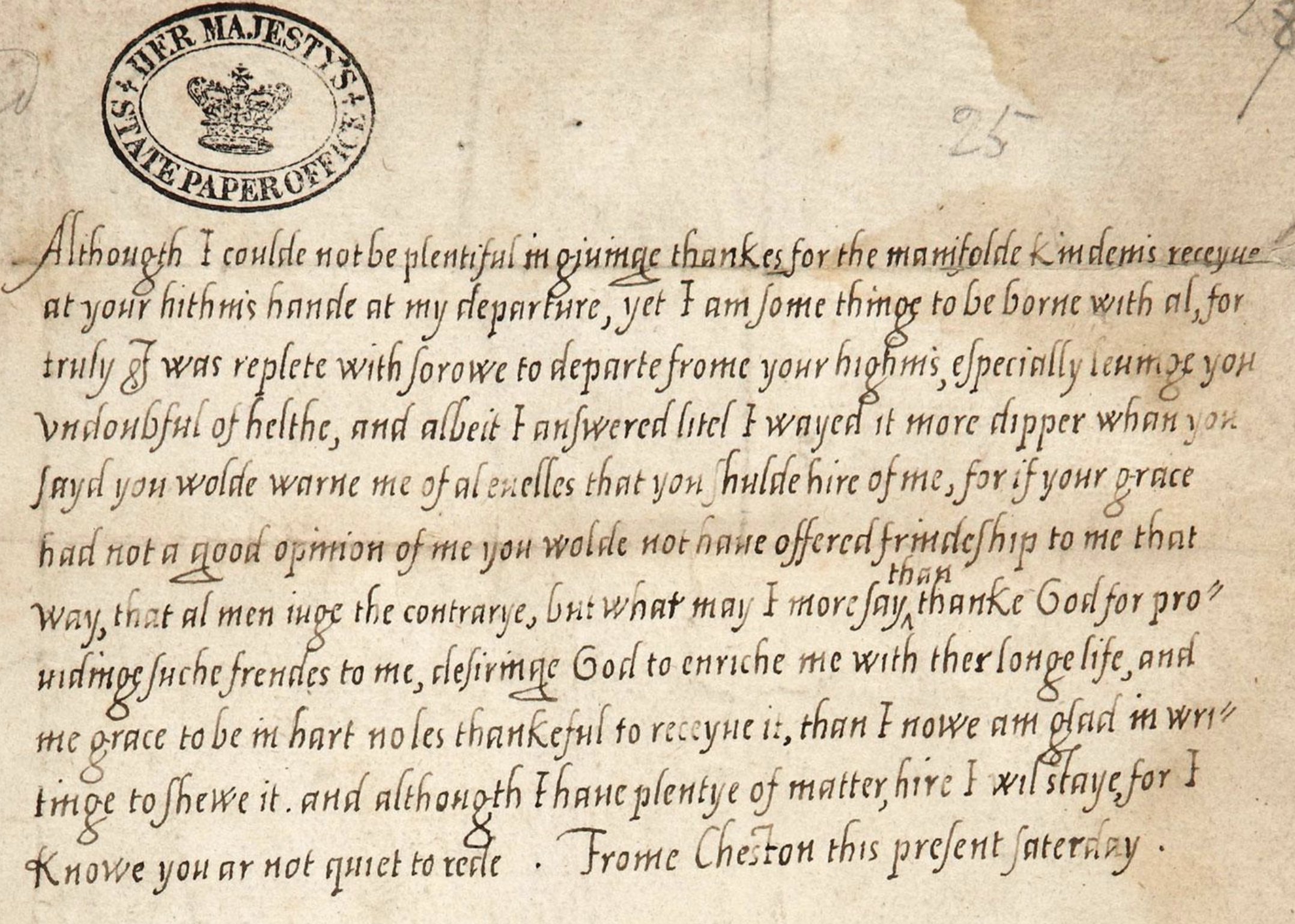
In this lesson we look at a form of handwriting that was used right through until the 1700s, when it was replaced by cursive handwriting. It is called Chancery, or Chancery Italic. I write it here in a very simple way, because this is for pupils who are learning to write.
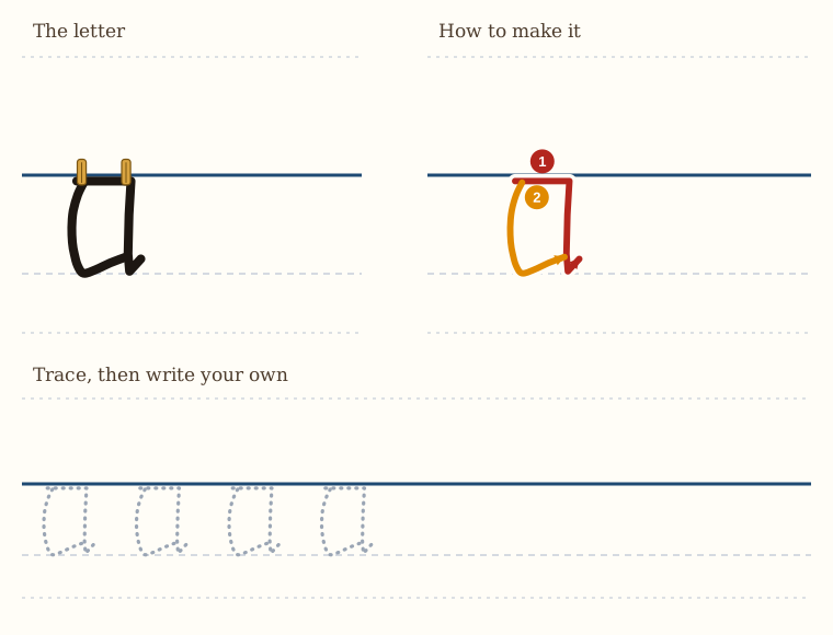
The reason I like this handwriting is that it is full of very rigid shapes. Take the letter a: we go across, come down, make an angle, come up, and then down and up. That is much easier for a pupil to do than to control a c shape, which is actually quite difficult.
So in Chancery the letters are made with very few curves. You already know the hanging alphabet from Lesson 2. Chancery Italic is the same idea, written a little more finely, with small ticks to finish the strokes. Keep the tops of your small letters at one height, hanging from the line, as you did in Lesson 2.
The letter a, basic Chancery Italic. In this letter, we also hang our letters from a line.
We run a cross at the top, just as in the first series of lessons, and down. The difference is that at the very bottom, we make a small little tick.
Then the shape, the second shape, the connecting shape, slightly bowed, like a bracket, and then we tick up.
The trick here is that the upward tick needs to be done a little bit fast, and so the letter then has a bit of elegance to it. And that is the trick.
The Letter b
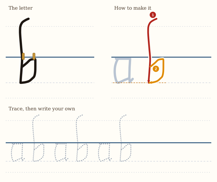
Here we have the letter b. There are some slight differences from the way the letter was formed the first time we learned it.
When we come down with the downstroke, we curve it a bit at the top. This curve can be slight, or you can exaggerate it if you want to. And then it comes down straight.
Then what we do is we don't draw a horizontal as we did the first time, but a bit below the clothes line, we angle up, and then we come down as though we're making a letter j, and we bring it in and touch the bottom of the downstroke.
And that gives us our letter b.
The Letter c
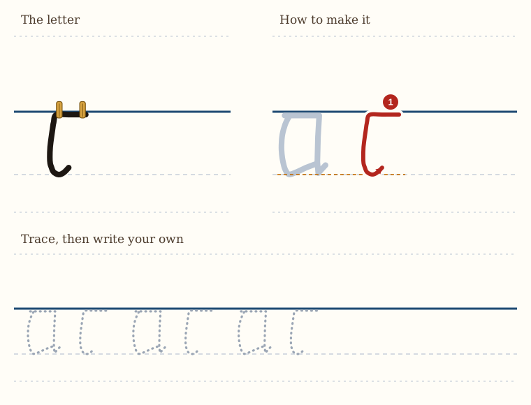
The letter c here is more or less the same as the letter c we learned the first time.
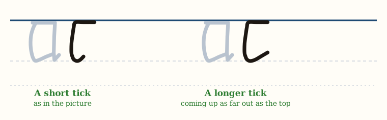
We start on the line from the right, we draw a horizontal, and then we drop down, and then we tick upwards at the bottom.
And that gives us our letter c.
The tick at the bottom can be short, like I have it here, or you can make it slightly longer so that it comes up and matches the same depth as the horizontal on top.
The Letter d
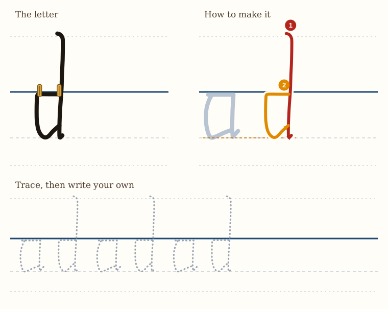
The letter d here is very similar to the letter d we made the first time.
The difference is that at the top, there is a curve. And then we go down, and when we get to the bottom, we make a very small tick forwards.
And then on the line, we go from the tall line to the left, and then we come down and make a backwards j, and tick up so it touches the tall line.
Now, this curve can be short, as I have it here, or you can make it a bit longer, like you can see in the examples that we showed you of the historical script.
The Letter e
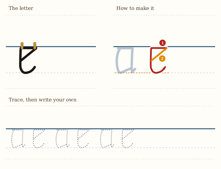
The letter e in this script is the same as the letter e in the previous script.
We make the horizontal line, and then we come down, and then we curve and tick forwards.
And then from the middle, we angle up to touch the end of the horizontal on the clothesline.
And that gives us our letter e.
The Letter f
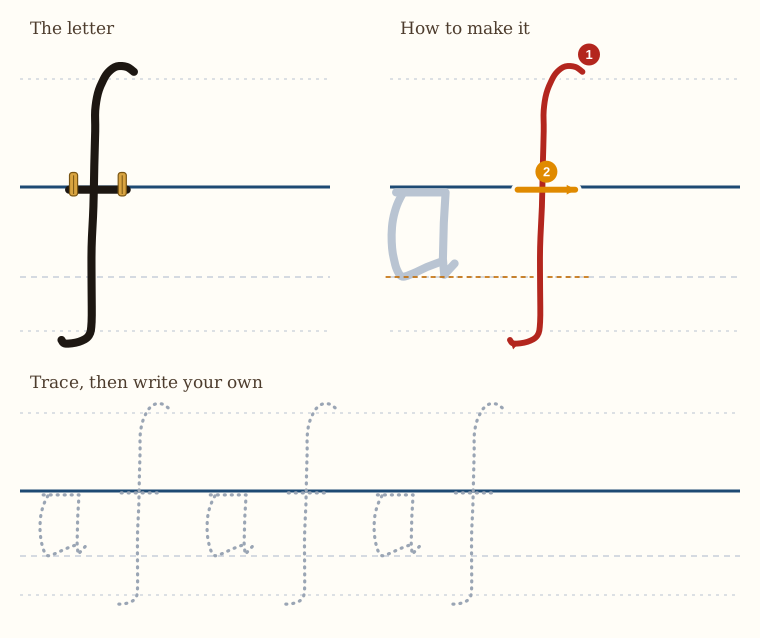
Here we have the letter f. We start quite high above the line and we descend quite low below the line. So it's rockets and submarines again. And it's curved. So it's like a very long curved s.
Small curve at the top, and then we come plunging down, and then we curve gracefully at the bottom.
And then we cross it on the line.
The Letter g
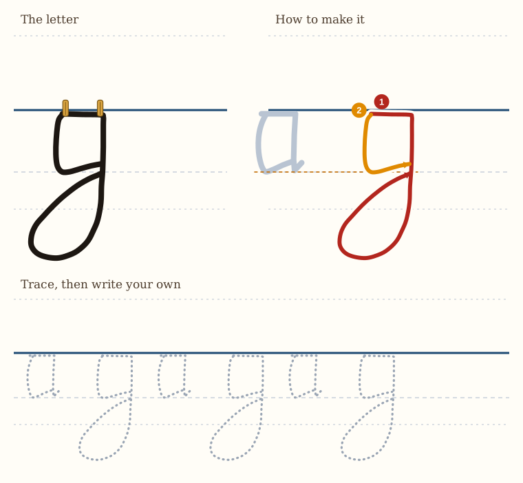
Here we have the letter g. It looks a little bit complicated, but it is not.
So we start on the line, we make a horizontal, and then we come down just as though we were making a letter j. So it goes down quite far, submarine, and then we keep curving in, and we curve all the way back, and we touch the line at the place where the bottom of the a will be.
And then we pick up our pen, and we go to the end, and we come down and tick in, just as we do when we make the letter a.
The Letter h
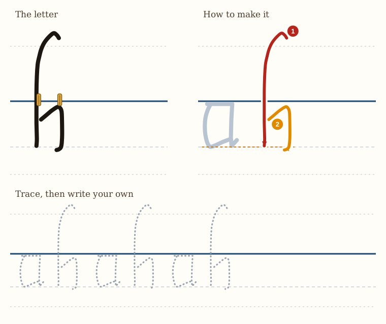
Here we have the letter h. It's a little bit different to the h we did the first time, but it is like the b that we just did before.
So we start off with our curve at the top, and then we bring it around and come straight down. Remember, this is quite high above the line, at least one letter above the line, maybe more. The forward curve can be a small amount or more. You can look at the historical example.
Then a bit below the line, we start with our second stroke, upwards on an angle, and then we make a little j shape, which comes down and does not touch the vertical. So it's like a small bracket, but it doesn't touch.
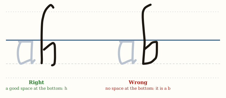
There's a good space at the bottom. If there were no space at the bottom, it would be a b, and that would be bad.
The Letter i
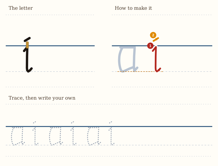
The letter i in this alphabet is slightly more decorative than the i we did in the basic form.
There's a very small tick up to the line, then we come down, and there's a little tick away at the bottom. But the line of the i must be straight.
And then we dot it, or put a little dash on the top, as before.
If the i is not straight, you might, if you are writing and reading in a hurry, think it was a c. So remember that the i needs to be straight.
The Letter j
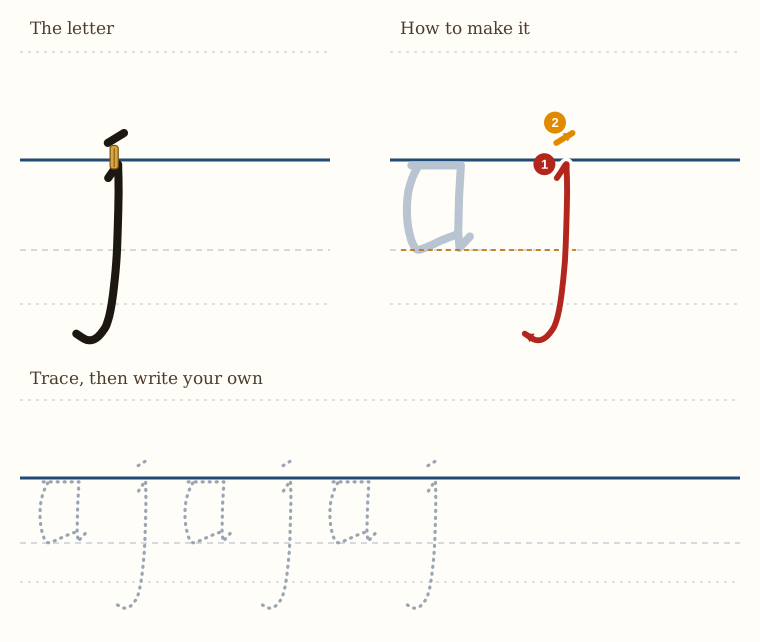
Here we have the letter j, which is the long i.
And like the i we just did before, it starts with a small tick up to the line. Then we come down straight, and we keep going down like a submarine. And at the bottom, we give it a nice curve.
And on top, we either dot it or put a small dash.
The Letter k
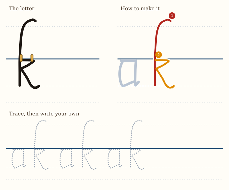
Here we have a letter k.
Once again, it has a curve at the top, a little flourish, and then it comes down and stops.
And then we pick up our pen, and we go to the point where it crosses the line. We go across, and then we come down and touch the vertical line. And then we give a little curve line for the bottom of the k.
And that little curve line can curl around a bit if you want to. And the curl at the top, which curls forwards, can also curl a bit more if you want it to. Look at the historical example.
The Letter l
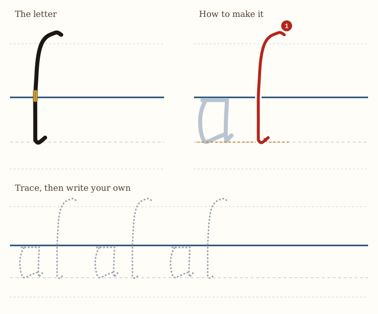
The letter l looks actually the same as the first stroke that we did for the letter k.
So we have a curve, and we come down straight, and at the bottom, a small tick forwards.
That's the only thing. The letter k doesn't have that small tick forwards at the bottom of its vertical stroke.
The Letter m
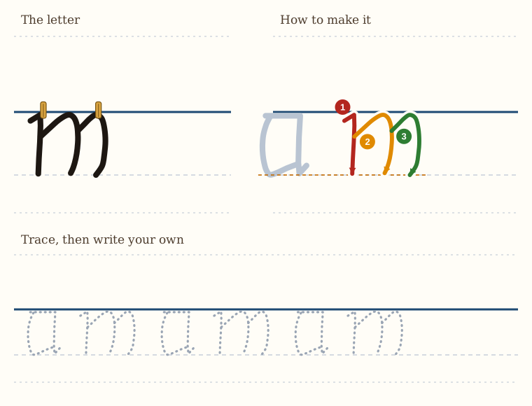
Here we have the letter m.
So we start off as though we were making an i, a small tick up to the line, and then straight down.
Then a bit below the line, we angle up, and then a slight curve down, backward stroke,
and then we repeat it again the second time, lifting our pen up, up to the line and a slight curve, backward stroke.
And that's our letter m.
So these are like two brackets, I suppose, or two parentheses, the kind you use in maths.
The Letter n
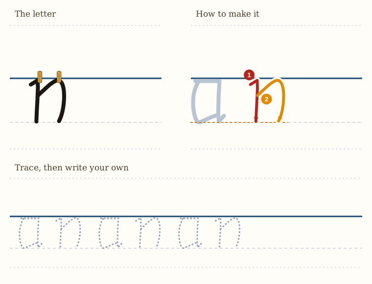
The letter n is made by
ticking up to the line, coming straight down,
and then a bit below the line, we go up on an angle, and then we make our curved line down, or our parenthesis shape down, little curve.
And that's the letter n.
The Letter o
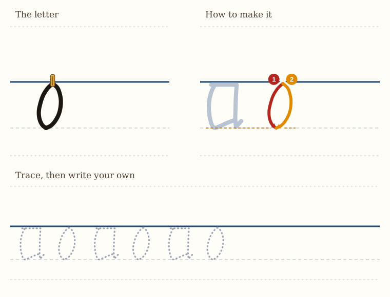
Here we have the letter o. This is the same lesson as we had in the previous set of lessons.
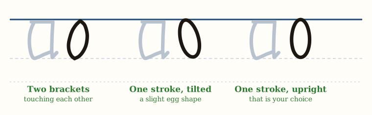
So you can form it by making two parentheses that touch each other,
two brackets that touch each other.
And the o is not circular, but it's slightly long and thin. Or you can draw it by hand as a slight egg shape. And this can be either tilted on its side slightly, as I have it here, or you can make it upright. That's your choice.
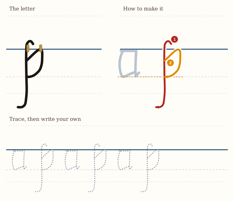
The Letter p
The letter p here starts a little bit above the line with a curve forward. So we curve backwards when we're writing it, because we start at the top.
And then we come straight down. And at the bottom, we curve away.
And then a little bit below the line, on our second stroke, we go up on an angle, and then make the small backwards j shape until we touch the vertical line.
And that is our letter p.
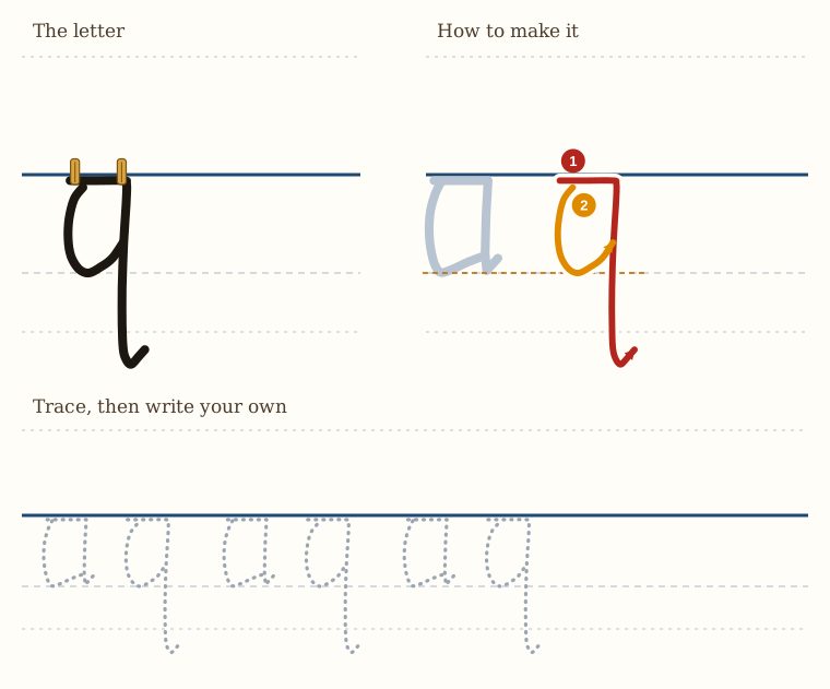
The Letter q
The letter q here is the same as the letter q in our first lesson, with the exception that at the bottom, the little flick away is slightly more decorative, or a little more curved, but otherwise it's the same.
So we go across, then we go down, and then we curve away at the bottom a little bit,
and then we take our second stroke and we make this small little j shape inside, just like we're making a letter a.
And that is our letter q.
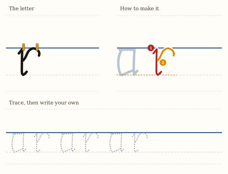
The Letter r
The letter r is formed from the letter i, the letter i that we learned in this lesson.
So we have a little tick up to the line, straight down, and then a little tick away at the bottom.
And then we make a curved line up. It touches the clothesline and then comes down a little bit.
And that's the letter r.
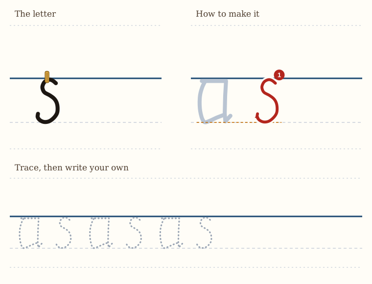
The Letter s
Here's the letter s. It's the same as the letter s in the first lesson. So it's a nice curvy shape.
The very top of it touches the line, and we curve it round.
Notice that the top curve is slightly smaller than the bottom curve. So think of it like a small head and a big belly.
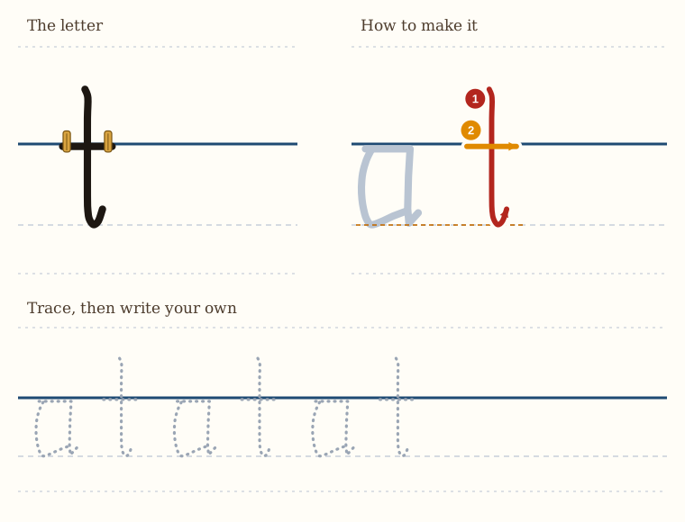
The Letter t
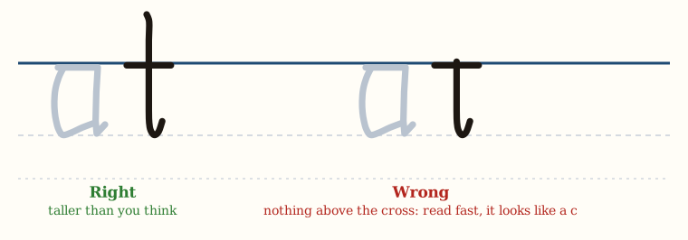
Here we have a little t, and the usual warnings apply. This letter is taller than you think it is.
So we start off quite a bit above the line, not as much as an l, of course. We come straight down, and then we tick away at the bottom,
and then we cross it on the line.
The Letter u
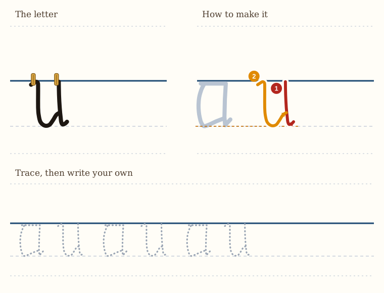
The letter u here is formed in a similar way to in the first lesson.
So we first start with the right-hand stroke. We come down, and then we flick away forwards.
And then we come back and we draw the second stroke. It's got a small tick up to the line, straight down, and then we curl it up and tick until it touches the first line.
And that gives us our letter u.
The Letter v
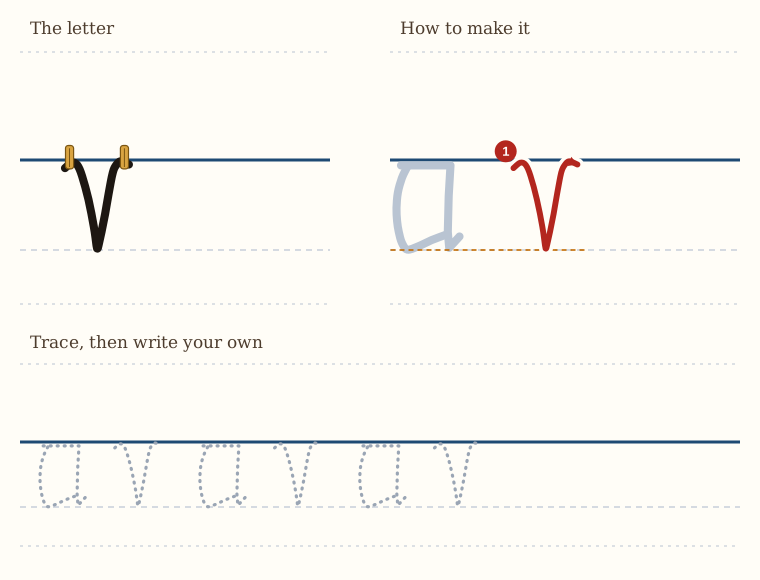
Our v here is more or less the same as the v in the first lesson, but it's slightly more decorative.
There's a small tick up to the line, then we make our normal v shape, and then a small tick at the end.
Both these ticks are right at the clothesline.
The Letter w
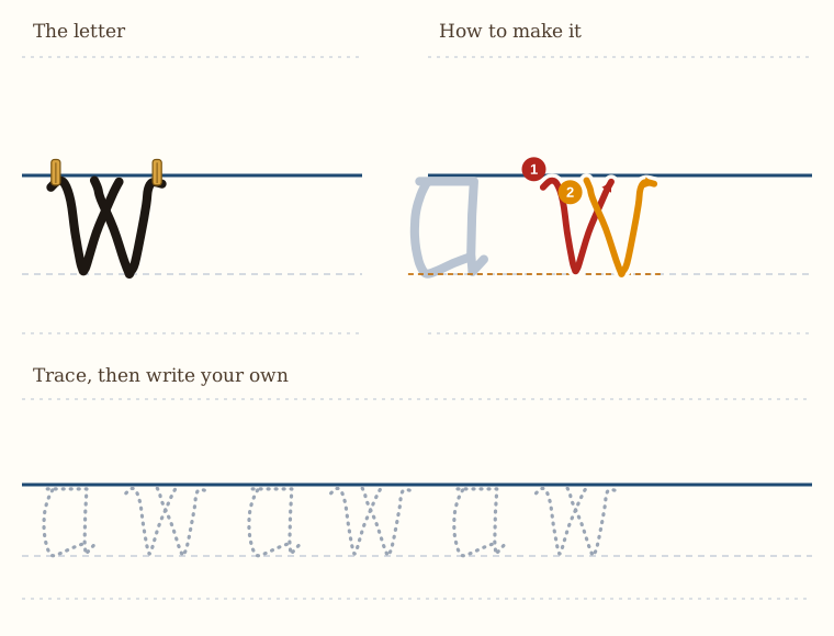
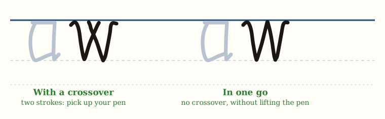
Here we have our w, and we have a choice with the w of crossing the two lines in the middle or not.
So we start off, small tick up to the line, and we make our v.
And then we pick up our pen, and we make our second v, coming straight down and up and tick away. And we have a slight crossover in the middle.
Or you can do it in one go: a small tick up to the line, a v, straight down to the second v, and then tick away, with no crossover, without picking up your pen.
So if we have a crossover, you have to pick up your pen. Or if you don't pick up your pen, we just have a straight line with a little tick at each end.
The Letter x
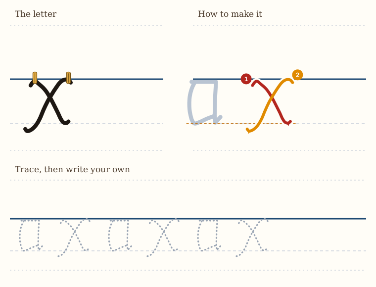
Here we have our letter x.
We curve up slightly to the line, and then we come down at an angle, and then we curve away at the bottom. This is the height of a letter a.
And then we pick our pen up, and above the bottom of the right-hand stroke, we start our downward stroke, and we go backwards. We curl up to the line, and then we come down, and then we curl away.
And this line can be longer than the first line, but that's your choice.
The Letter y
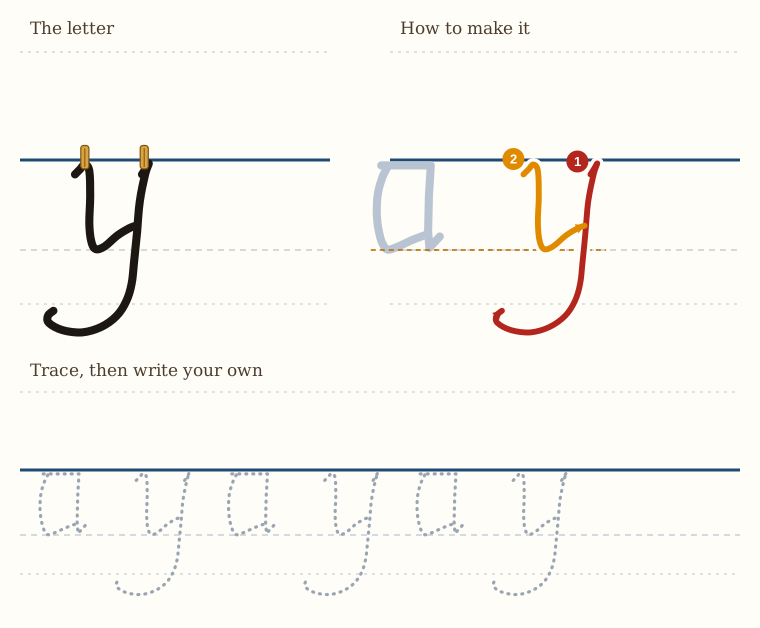
The letter y is formed from a j shape.
So we tick up very slightly to the line. We come down straight and do a nice curve at the bottom. Remember, this is a submarine. We go down quite far.
And then we pick up our pen. We go back to the line. We tick up, come down to the depth of an a, and then flick it in to touch the j shape.
And we have our letter y.
The Letter z
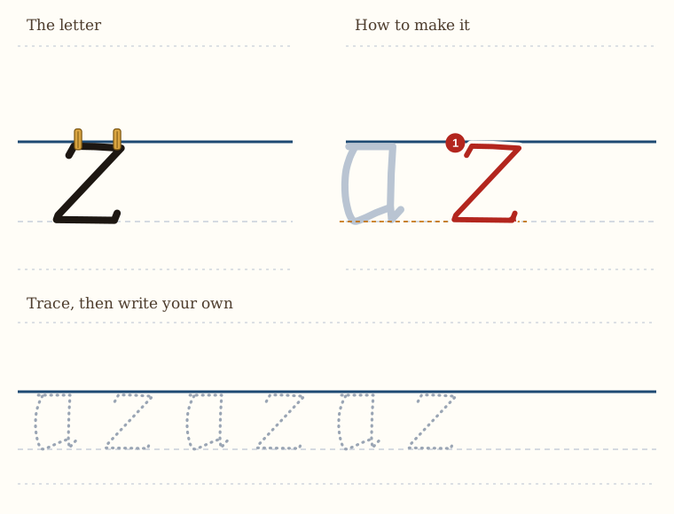
And finally, we've arrived at z: zed, or zee, depending on where you come from.
So what we do is we flick upwards slightly, then we do our horizontal, then we come down on the angle, horizontal below, and then flick up a tiny bit.
And that's our letter z.
A Historical Example: Princess Elizabeth
Princess Elizabeth, daughter of King Henry VIII's penmanship at age 15, 1548. As you can see, many of the forms of the letters we have learned here in this book are the same.