

Lesson 27
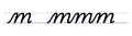
Our next letter is the letter m. It's as if we're making an i. We go up straight and light, and then we come down at the angle that all our letters are at. And then we come up again on the same line, we move forwards, and we come down again. We come up on the same line, we move forwards in a slight curve, and we come down again, and then we tick away.
Now, the thing that happens with the m, and it happens to a great many pupils who try to learn this letter, is that they make the second bump smaller than the first bump, so it becomes the great shrinking m. You don't want to have a great shrinking m. You want to make sure that your second bump is as high as your first bump. For some reason, the human brain wants to make the second one smaller, and so you need to be awake when you do it, and make sure that both bumps are the same height.
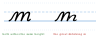
And that's all there is to it, really. It's just like a doubled n, and we've done an n before. And we just did a p, which has got the same shape. So it's not that difficult. Light up, dark down, light up, dark down, light up, dark down, tick away. And that is the letter m.
Cursive — Part One: The Small Letters · Evan Millner · Published by Abecedaria Press